Startup Blog and Drip Campaign
Establish Brand and a Design System for a Fintech Startup
Abstract
The client provides industry-specific credit cards for independent business owners via trade association partnerships. The assignment was to design the first email in a drip campaign promoting a co-branded credit card for members of a national pharmacy association, with visuals and messaging emphasizing trust, credibility, and relevance.
The original creative direction favored a casual, approachable style, assuming rural small business owners would respond better to less formal visuals. Research revealed, however, that many members are highly educated professionals or successful entrepreneurs who prefer brands that convey professionalism and stability.
Based on this, I developed two design paths:
Formal and conservative — aligns with traditional financial institutions for older, more conservative members.
Modern and vibrant — appeals to younger, digitally savvy members.
Both approaches allow A/B testing to determine which tone drives stronger engagement while maintaining brand cohesion.
General Design Decisions
Dual Branding Challenge
The client partners with other companies, organizations, and trade associations, which means both logos often need to appear in marketing materials. This makes establishing a strong, cohesive brand identity more difficult. Initial solutions, such as using abstract imagery or nature photos, were deemed visually weak—inoffensive but not striking or memorable.
Understanding the Target Demographic
The company is still in its early stages, and the target demographic change drastically with every product. To better understand who engages with their communications, I designed for A/B tests. These tests will help determine which visuals, messaging, and layouts resonate most with the audience, providing actionable insights to refine the design strategy.
Catering to a Traditional Audience
The primary audience for this product for the pharmacy industry mostly consists of rural business owners, many of whom prefer more traditional modes of communication. Design choices reflect this: larger fonts for readability, prominently displayed phone numbers to encourage direct contact, and clearly emphasized key points such as “no hidden fees.” Although the company is tech-focused, its communication style must align with an older, less digitally native audience.
Drip Campaign 1
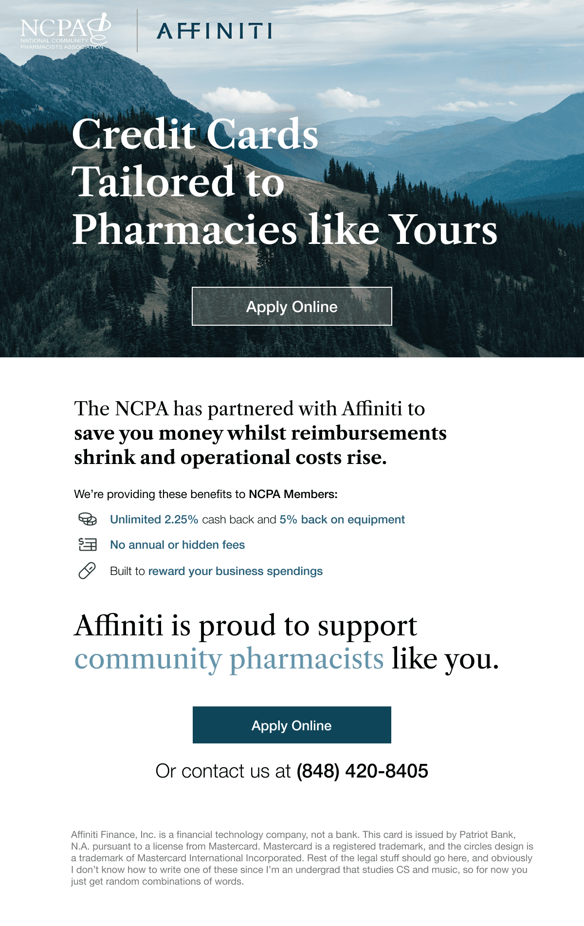
Version A — Older Pharmacy Owners
Target audience: Older pharmacy owners who tend to respond more positively to traditional financial messaging.
Key design decisions:
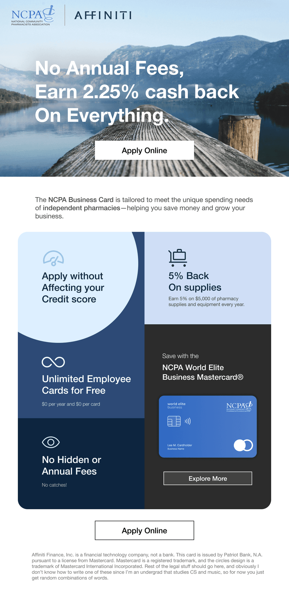
Phone number included as a secondary CTA — older customers often prefer phone communication.
Title includes “No Hidden Fees” — addresses a common concern about fine print in bank contracts.
Large font sizes — improves accessibility and ease of reading.
Card redesign — replaced neon blue (which clashed with both logos and lacked trustworthiness) with a more conservative palette.
I also used nature imagery in the header, as abstract graphics didn’t visually complement both logos without creating clashes.
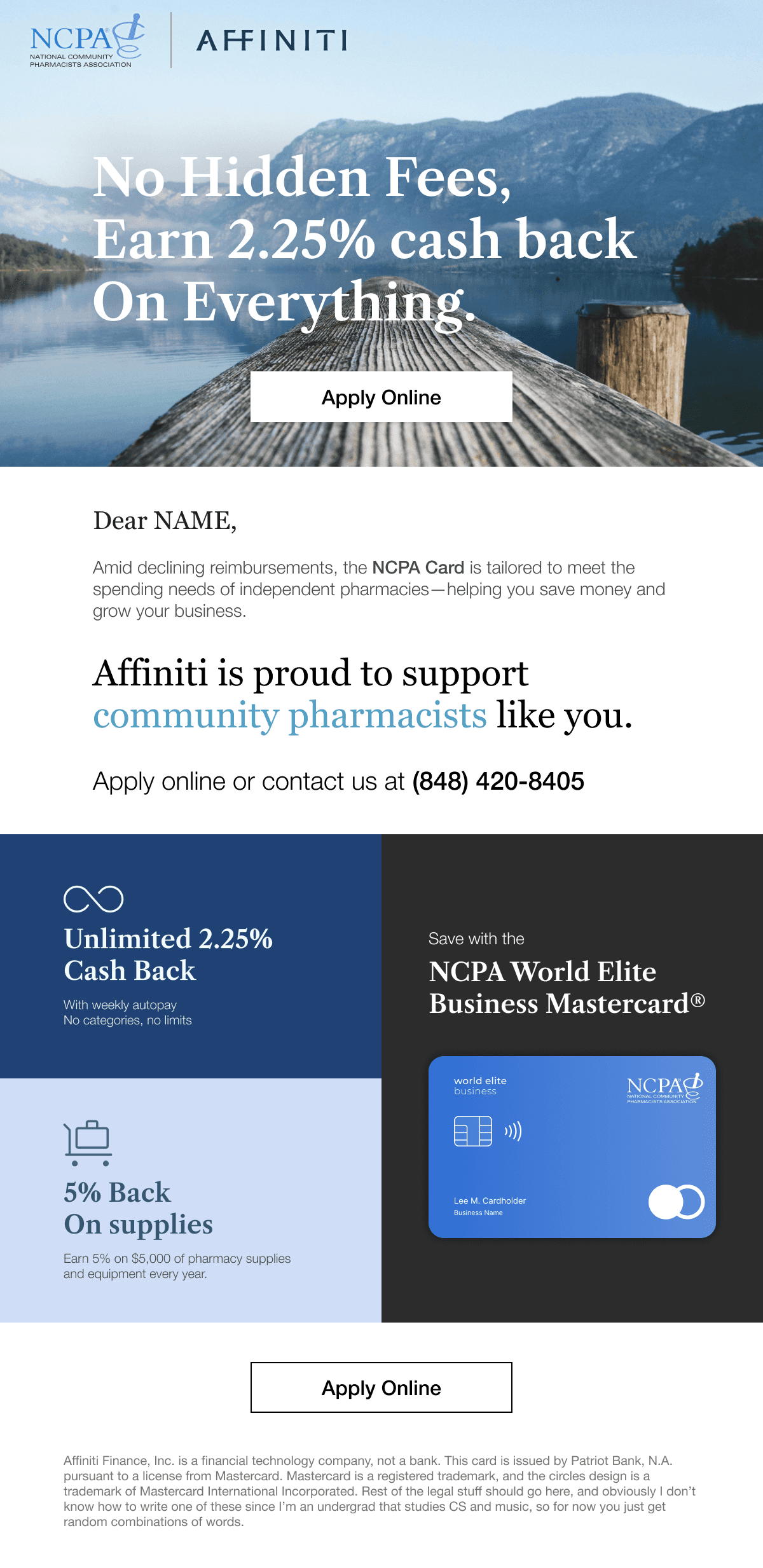
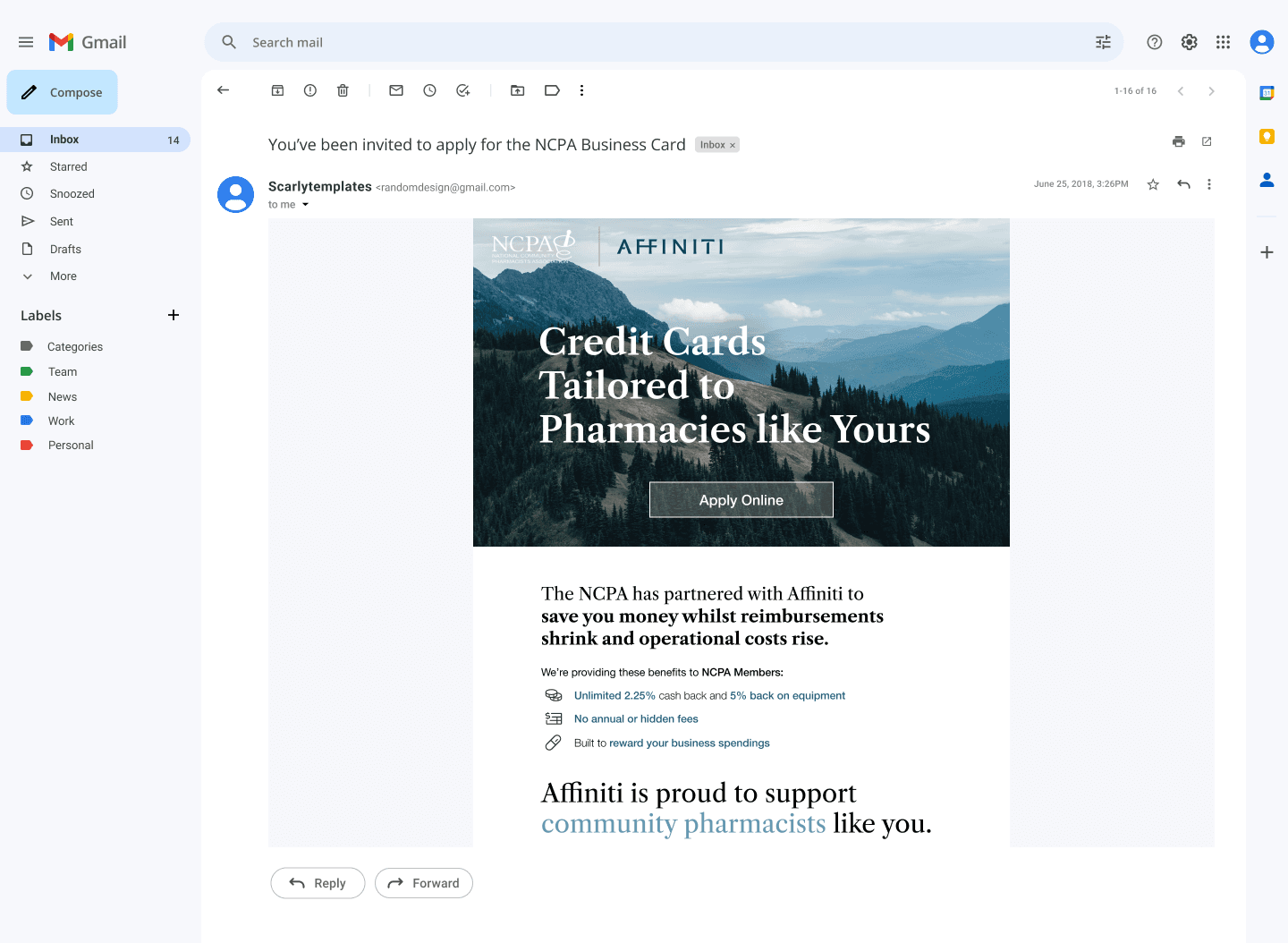
Version B — Younger Pharmacy Owners
Target audience: Younger pharmacy owners, whether new to ownership or more experienced, who are accustomed to modern, digital-first banking platforms.
Key design decisions:
Vibrant colors, modern fonts, and contemporary layout to match digital banking expectations.
Moved “Apply Without Affecting Your Credit Score” to the top — addresses a top-of-mind concern for younger owners, especially those who may have recently taken out business loans.
Removed phone number to reduce clutter and focus on online application; also enables A/B testing against Version A.
Drip Campaign 2
Version A — Older Pharmacy Owners
Target audience: Older pharmacy owners who tend to respond more positively to traditional financial messaging.
Key design decisions:
Phone number included as a secondary CTA — older customers often prefer phone communication.
Title includes “No Hidden Fees” — addresses a common concern about fine print in bank contracts.
Large font sizes — improves accessibility and ease of reading.
Card redesign — replaced neon blue (which clashed with both logos and lacked trustworthiness) with a more conservative palette.
I also used nature imagery in the header, as abstract graphics didn’t visually complement both logos without creating clashes.
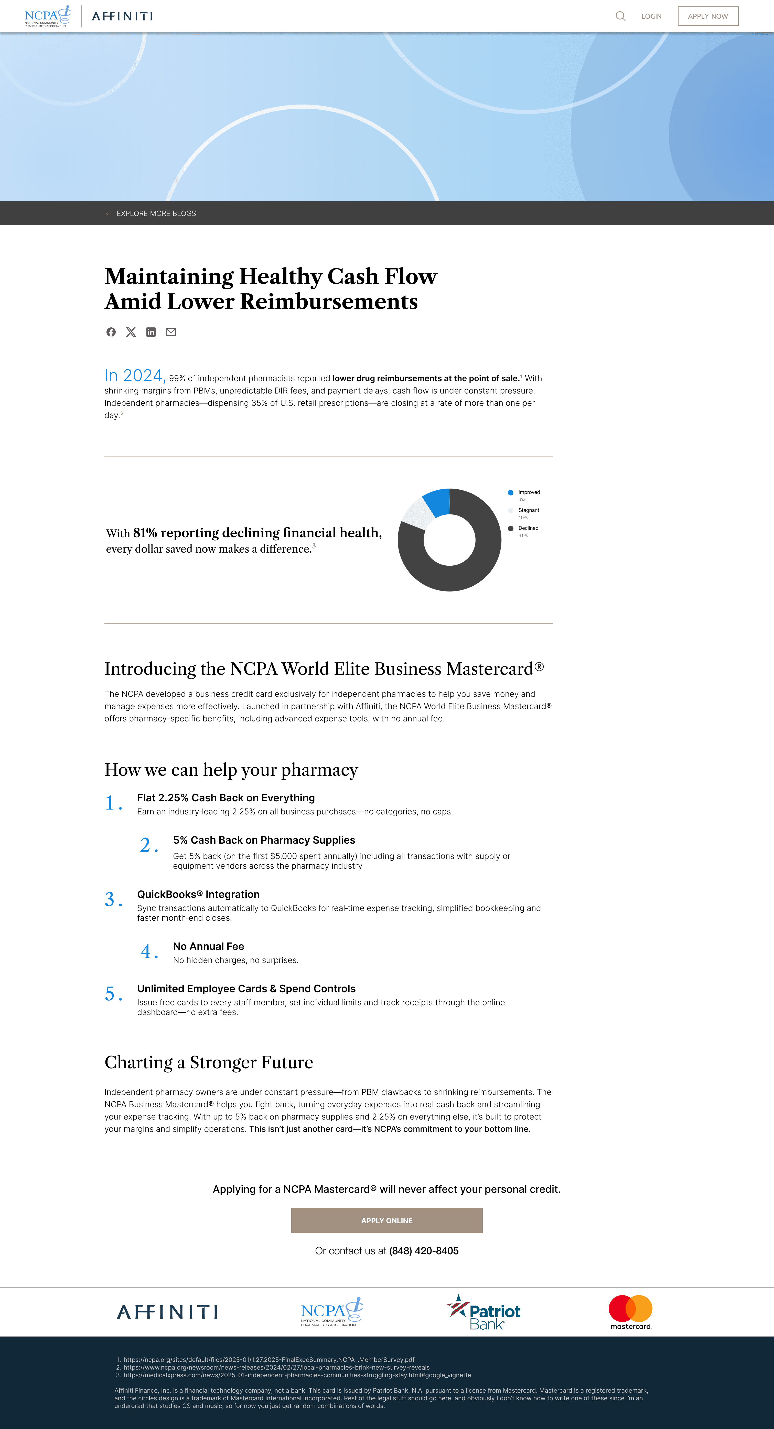
Website / Blog Design Concepts
Version A — Older Pharmacy Owners
This is an example of what the revamped website/blog could look like. As mentioned before, because the logos are dynamic—Affiniti partners with many different companies and associations—it’s challenging to create illustrations or graphics that suits the brand.
For the graphics, I illustrated and animated abstract visuals that can be used flexibly, regardless of which logos are included. Outside of that practical standpoint, I chose a sky blue tone that aligns with NCPA’s logo while also encouraging customers to perceive the Affiniti brand as trustworthy and non-threatening—qualities often associated with sky blue, a color abundant in nature.
I developed two versions of the website. The one shown below is the more formal version, inspired by traditional banks and consulting firms, with minimal graphics.
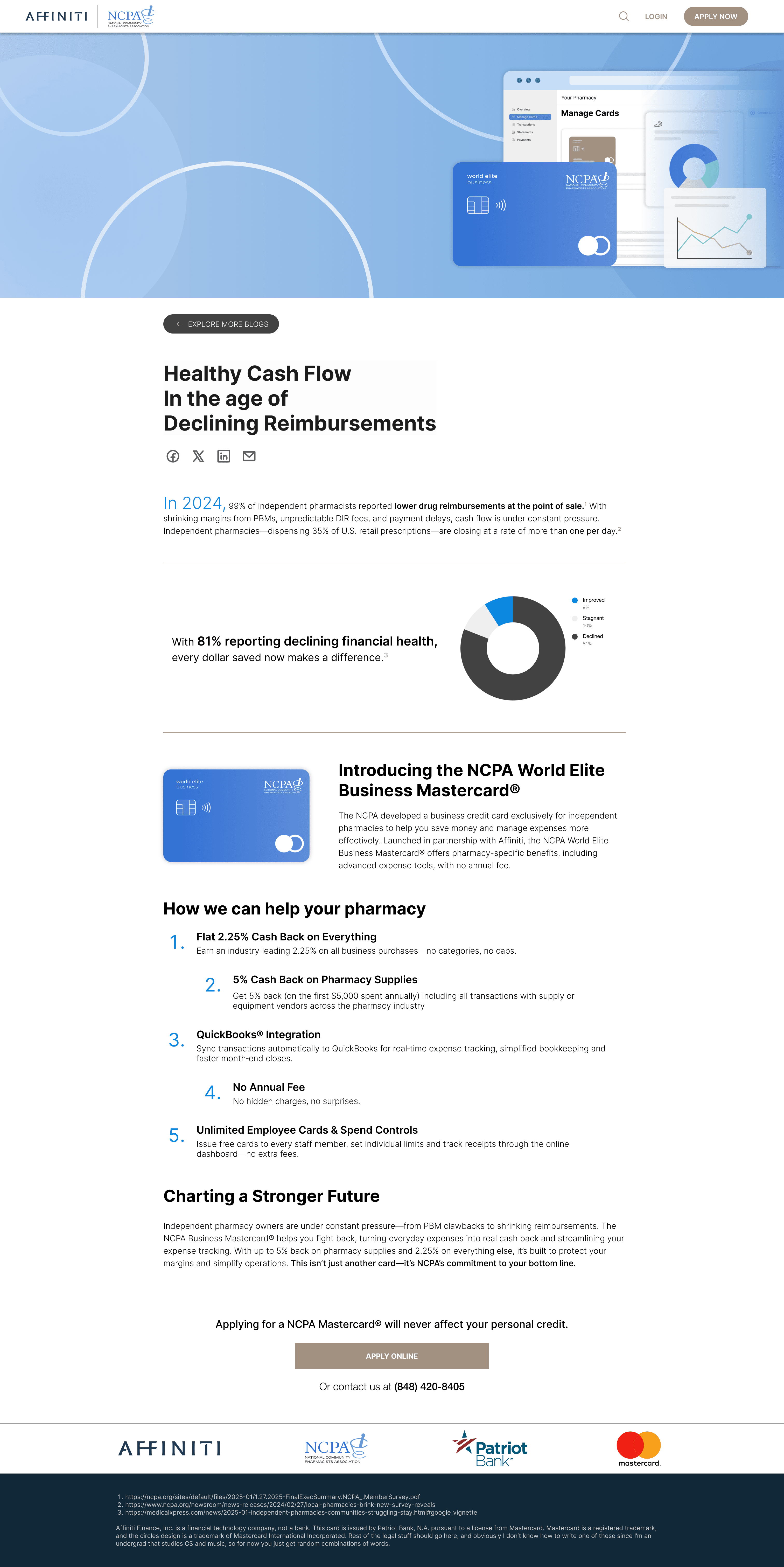
Version B — Younger Pharmacy Owners
This version is inspired by modern consumer finance platforms like Zelle and Venmo. I illustrated the bookkeeping system featured on the ncpacard.com website, providing an all-in-one view of the credit card and related services.
The design incorporates contemporary graphics; however, it feels somewhat awkward due to a mismatch in branding—the NCPA logo uses a serif font, while the Affiniti logo conveys a more corporate, private equity style, almost suggesting a secretive company with vast influence.
To address this mismatch, I recommend shifting toward a more image-driven UI rather than a graphics-driven approach, which would better balance the overall aesthetic.